Co do rudego na pierwszym planie, to kwestia gustu Marcinie. Tak jak już mówiłem, mnie się podoba. Z tym podpisem to tak mi tylko przyszło do głowy, żeby jak ktoś sobie to zdjęcie ściągnie miał trochę kłopotów z usuwaniem tego tekstu zanim zacznie się chwalić, ze to jego dzieło! ;))
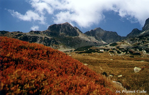
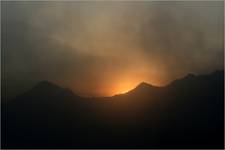
A ja usunąłbym pierwszy plan nieostrych czerownych krzaczków i usunął lekkie wynietowanie i zmniejszyłbym działanie filtra polaryzacyjnego.Byłem w gorach i widziałem jesień. góry wcalnie nie są takie bardzo ciemne, zaś niebo jest niebieskie,ale nie aż tak. Myśle ze dobrym przednim planem byłyby np. kamienie, nie jasne,ale szare tak, aby komponowały się z góramy,aby obraz płynął od kamieni spod stóp w kierunku wierzchołków gór. Obraz przesunąłbym o 10 - 15 stopni w prawo. Niemniej jednak - bardzo podoba mi się.
no to jak takie było zamierzenie autora, to sorry... Wg mnie powinien jednak pierwszy plan być ostry (wtedy może troche inaczej wykadrować) Ale oczywiście to sprawa gustu...
Nie podoba mi się pierwszy nieostry plan. Moja dobra rada na przyszłość: noś statyw, albo jakiś worek, który mógłbyś czymś wypełnić i póżniej uformować.
W tym przypadku przydałaby się zdecydowanie jedna z końcowych, najmniejszych przysłon. No chyba, że było wietrznie i nie chciałeś aby Ci wyszedł długi czas- wtedy trochę usprawiedliwione. Kolory ładniejsze wyszłyby na pozytywie. Poza tym podpis autora moim zdaniem trochę przeszkadza i powinien znaleźć się pod zdjęciem np. w innej ramce. Pozdrawiam.
Z tym brakiem ostrości to nie był przypadek. Ustawiłem przesłonę 5.6 i dałem płaszczyznę ostrości na góry w tle. Takki był mój zamysł bo uznałem iż tekstura czerwonych jagodzin na pierwszym planie za mocno absorbowała by oko obserwatora. Howgh!
Chyba nie za bardzo udało mi się usunąć tę domieszkę magenty... Nie wiem, ale u mnie nie bardzo to widać... Zostawiam tak jak jest. Trudno. Pozdrawiam.
Komentarze
Dziękuję.
... ehhh.... jeszcze kolorami jesieni w Tatrach nie mialam okazji sie zachwycac... pieknie u Ciebie w tym folderze - pieknie!!!
sentymentalne
Cieszę się, że Ci się podoba. Jak widzisz zdania na temat kadru są podzielone. Pozdrawiam.
Bardzo ładny widoczek, ten rdzawy kolor po prostu sliczny... Bardzo mi się podoba i swietnie wygląda jako tapeta na monitorze. Pozdrawiam :-)))
Co do rudego na pierwszym planie, to kwestia gustu Marcinie. Tak jak już mówiłem, mnie się podoba. Z tym podpisem to tak mi tylko przyszło do głowy, żeby jak ktoś sobie to zdjęcie ściągnie miał trochę kłopotów z usuwaniem tego tekstu zanim zacznie się chwalić, ze to jego dzieło! ;))
Przemo, skoro chciales nieostre to rude, to IMHO znacznie mniej kadru powinno zająć... a co do promocji, jest przeciez podpis POD zdjeciem ;)
ha, ha, ha! Te, dowcipniś! :))
podpis powiększ ;)
Hej Mruszkowski! Latem też bywa fajnie, ale jesień jest super! Pozdrawiam!
ale fajne kolory teraz w górach...latem się szwada człowiek i nudy dla aparatczyka
Dzięki! Co do punktu 1 to wyjaśniłem swój pomysł trochę poniżej (z tą małą przesłoną) a co do punktu 2 to zaczynam sie promować! ;))
Bardzo ładne, jedyne moje uwagi to 1) rozciagniecie Go rowniez na pierwszy rudoczerwony plan (f22?) 2) mniej rzucajacy sie w oczy podpis na zdjeciu
Dzięki za uwagi! Nie wiem jak u was z jasnością monitorów, zle jeżeli ma się trochę mocniej ściemniony to to zdjęcie wcale nie wygląda... Pozdrawiam.
uciety szczyt po prawej... ogolnie bdb.
A ja usunąłbym pierwszy plan nieostrych czerownych krzaczków i usunął lekkie wynietowanie i zmniejszyłbym działanie filtra polaryzacyjnego.Byłem w gorach i widziałem jesień. góry wcalnie nie są takie bardzo ciemne, zaś niebo jest niebieskie,ale nie aż tak. Myśle ze dobrym przednim planem byłyby np. kamienie, nie jasne,ale szare tak, aby komponowały się z góramy,aby obraz płynął od kamieni spod stóp w kierunku wierzchołków gór. Obraz przesunąłbym o 10 - 15 stopni w prawo. Niemniej jednak - bardzo podoba mi się.
za dużo dołu ... poza tym bardzo ładnie ...
Dzięki Piotrze za radę i ocenę.
no to jak takie było zamierzenie autora, to sorry... Wg mnie powinien jednak pierwszy plan być ostry (wtedy może troche inaczej wykadrować) Ale oczywiście to sprawa gustu...
Nie podoba mi się pierwszy nieostry plan. Moja dobra rada na przyszłość: noś statyw, albo jakiś worek, który mógłbyś czymś wypełnić i póżniej uformować. W tym przypadku przydałaby się zdecydowanie jedna z końcowych, najmniejszych przysłon. No chyba, że było wietrznie i nie chciałeś aby Ci wyszedł długi czas- wtedy trochę usprawiedliwione. Kolory ładniejsze wyszłyby na pozytywie. Poza tym podpis autora moim zdaniem trochę przeszkadza i powinien znaleźć się pod zdjęciem np. w innej ramce. Pozdrawiam.
Z tym brakiem ostrości to nie był przypadek. Ustawiłem przesłonę 5.6 i dałem płaszczyznę ostrości na góry w tle. Takki był mój zamysł bo uznałem iż tekstura czerwonych jagodzin na pierwszym planie za mocno absorbowała by oko obserwatora. Howgh!
Z tym pierwszym planem to moze faktycznie troche za duzo, i moze bardziej ostry by sie przydal, ale i tak bardzo mi sie podobuje!
A mnie się tam pierwszy plan podoba! Tak miało być i już! Dzięki i pyzdry!
uuupss... sorki.. nie do ciebie mialo to byc...
eeee.. boimy sie kiepskich komentarzy??????
Jak dla mnie, to pierwszy plan nie komponuje się z drugim
Dobre jest!!! Może pierwszego planu w LD ciut za dużo, ale pięknie!!!
Chyba nie za bardzo udało mi się usunąć tę domieszkę magenty... Nie wiem, ale u mnie nie bardzo to widać... Zostawiam tak jak jest. Trudno. Pozdrawiam.