Własnie się przepychasz troszkę ...ja mówię swoje a Ty swoje :). Zobaczymy jaką tendecję przybiorą Twoje "losowe podpisy " w przyszłosci ;). Pewnie nie raz będę jeszcze natrEntny ;). Miłego weekendu. Lecę na foty
Teraz się tylko obawiam, że uparcie i naprzekór następna praca będzie z podpisem gdzieś w centrum albo pod pachą i dużo większy, tak żeby zamanifestować, że nie rusza Cię krytyka co do podpisu, no ale zobaczymy, mam nadzieję jednak, że podpisy u Ciebie bedą coraz mniejsze aż znikną całkowicie ;)
ojej WildWhisper, no przykro mi, że tak dotkliwie ograniczam Ci pozytywny odbiór moich zdjęć, ale cieszę się, że mimo wszystko pozytywnym pozostaje :) Idenie, czepliwość i jej brak to chyba kwestia wieku... ;)
Ja nie szukam błędów... Patrzę na pracę i potrafię stwierdzić, czy mi coś przeszkadza w odbiorze czy nie, i to wychodzi samo. Często jest tak, że błedy wcale mi nie przeszkadzają takie jak słaba jakość, pomyłka z GO, posypane tony... . A podpisy na fotografii prawie zawsze ;). Jak napisałem bardziej lub mniej przeszkadzają. Tutaj oceniłem bo akurat los tak chciał ( jak się deklarujesz), że ślepym trafem dałaś mały podpis i tak zlokalizowany, że w takiej postaci mi przeszkadza tylko troszkę. Jestem fanem Twoich prac. Ale gdybyś ich nie wstawiała byłbym jeszcze większym.
WildWhisper, każdy oglądacz szuka w pracy czegoś, jeden treści, inny błędów, jeszcze inny ze względu na treść, która do niego przemawia jest w stanie wybaczyć błędy i tak to się kręci... :)
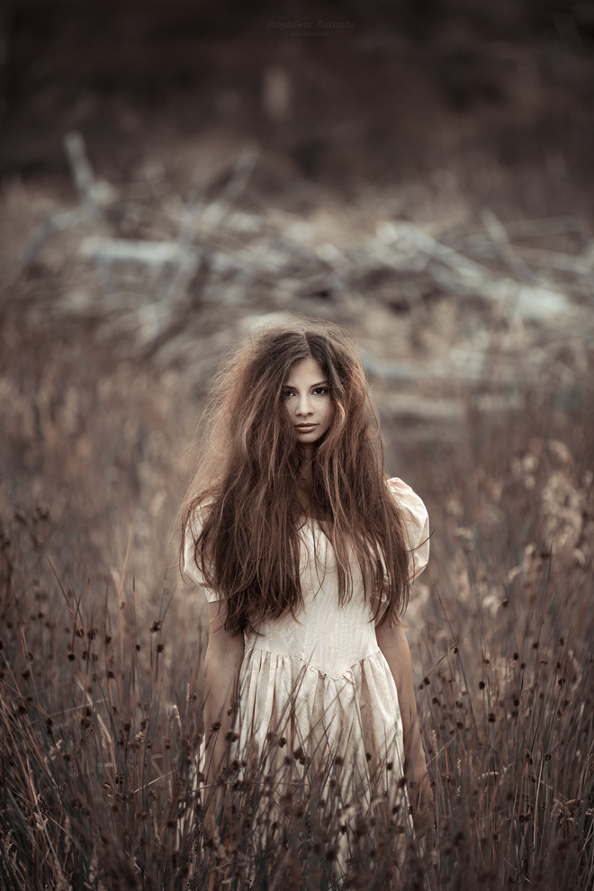
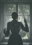
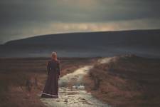
Kurdę już miałem do Selgrosu jechać, by sobie kupić nowy monitor, gdyż nigdzie nie mogłem znaleźć tego podpisu. A ja durny po prostu nie do końca przewinąłem zdjęcie i nie zauważyłem tych drobnych literek na samej górze. Zdjęcie wywarło na mnie jakieś wrażenie, skupiłem się na delikatnej buzi dziewczyny, pięknych włosach i sukni, o której już pisałem. Ogólny wydźwięk zdjęcia jest bardzo pozytywny. Podobnie jak w życiu nie czepiam się zbyt szczegółów. Wiem, że dla niektórych jest to bardzo ważne, ale ja często sobie to odpuszczam, gdyż są dla mnie ważniejsze i ciekawsze rzeczy. Ale się rozpisałem, zaraz pewnie usłyszę, że przez takich jak ty Iden ten portal ginie. :)
ojj tam błENdy chodzą po ludziach ;). Chyba powinienem się jak autorka upierać na to natrENctwo teraz , bo przecież mogę ;). Ale tez mogę przyznać się do błędu i to nie jednego ;)- zdarza mi się niestety wiele popełniac, nie tylko ortograficzne. Co do podpisu... Marcin ma rację, podpisy zawsze psują odbiór widza. Jedne bardziej inne mniej. Zazielona... napisałaś: " oglądacz, któremu w pierwszej kolejności rzuca się w oczy podpis raczej nie będzie moim fanem, zwyczajnie nie znajdzie u mnie nic godnego swej uwagi, za bardzo wszystko popsute ". Guzik [prawda, nie deklasuj widzów z tego powodu, że wytykają Ci podpisy albo co innego. Ja w wielu Twoich pracach pomimo brzydkich podpisów, widzę wiele wspaniałości. Ale tych prac z najbardziej nieudanymi i jak to napisałaś z " przypadkowo zlokalizowanymi " podpisami staram się nie oceniać. To jest prawie to samo jakby mi ktoś napluł do lemoniady, którą uwielbiam.
kilka dni temu byłam na wystawie obrazów Józefa Chełmońskiego, na jednym z nich wyraźny podpis Mistrza walnięty był prawie centralnie, uśmiechnęłam się do siebie i pomyślałam, jak zjechany za to zostałby przez ówczesnych odbiorców :)
dziękuję Marcinie :) oglądacz, któremu w pierwszej kolejności rzuca się w oczy podpis raczej nie będzie moim fanem, zwyczajnie nie znajdzie u mnie nic godnego swej uwagi, za bardzo wszystko popsute :)
wszystko zależy od tego, na czym oglądacz koncentruje swoją uwagę, i bez podpisu można znaleźć mnóstwo powodów psujących odbiór, jeśli się tego właśnie szuka :) nie mnie to zmieniać i się temu podporządkowywać :)
Marcinie wuu, w ogóle najlepiej wedle uznania, ja tam lubię sobie podpisik walnąć, czy istnieje jakiś ważki powód, dla którego powinnam sobie tej przyjemności odmówić? :P
WildWhisper, a czepiaj się, natrENtnie, konsekwENtnie i bez opamiENtania, pamiENtaj tylko, że u niektórych takie głośne natrENctwo może wywołać skutek wrENcz odwrotny :))) Idenie, również tak uważam, stąd takie a nie inne u mnie stylizacje :)
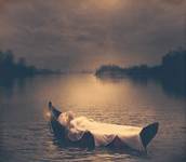
Dodam, że ta dziewczyna na tym obrazie jest częścią otaczającej jej natury, a natura czescią tej dziewcyzny. Świetnie do siebie pasują i wzajemnie uzupełniają - to takie miłe dla oka. Autorka ma wyczucie smaku w tej kwestii.
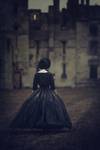
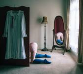
O i tu też świetnie wkomponowany popdpis o ile już musi być ;). Przecudna modelina choć roztrzepana z jakiegoś zamysłu, stonowana choć taka "szlachetna tonacja "- z resztą bardzo miła dla oka również na plus. Bardzo mi się podoba ta praca.
Komentarze
ale pioruny musiały walic ;) fajne
Prawdziwe naturalne piękno.
facet pyta co to jest armat :)
wiadomo, armat to podstawa
Urocze barwą i armatem
Gut.
Pieknie, naturalnie
Ładna praca
niech Ci będzie WildWhisper :) udanych fot :)
Własnie się przepychasz troszkę ...ja mówię swoje a Ty swoje :). Zobaczymy jaką tendecję przybiorą Twoje "losowe podpisy " w przyszłosci ;). Pewnie nie raz będę jeszcze natrEntny ;). Miłego weekendu. Lecę na foty
WildWhisper, przepychanki, manifestacje, nie ten wiek, już wyrosłam :)
Teraz się tylko obawiam, że uparcie i naprzekór następna praca będzie z podpisem gdzieś w centrum albo pod pachą i dużo większy, tak żeby zamanifestować, że nie rusza Cię krytyka co do podpisu, no ale zobaczymy, mam nadzieję jednak, że podpisy u Ciebie bedą coraz mniejsze aż znikną całkowicie ;)
ojej WildWhisper, no przykro mi, że tak dotkliwie ograniczam Ci pozytywny odbiór moich zdjęć, ale cieszę się, że mimo wszystko pozytywnym pozostaje :) Idenie, czepliwość i jej brak to chyba kwestia wieku... ;)
Ja nie szukam błędów... Patrzę na pracę i potrafię stwierdzić, czy mi coś przeszkadza w odbiorze czy nie, i to wychodzi samo. Często jest tak, że błedy wcale mi nie przeszkadzają takie jak słaba jakość, pomyłka z GO, posypane tony... . A podpisy na fotografii prawie zawsze ;). Jak napisałem bardziej lub mniej przeszkadzają. Tutaj oceniłem bo akurat los tak chciał ( jak się deklarujesz), że ślepym trafem dałaś mały podpis i tak zlokalizowany, że w takiej postaci mi przeszkadza tylko troszkę. Jestem fanem Twoich prac. Ale gdybyś ich nie wstawiała byłbym jeszcze większym.
WildWhisper, każdy oglądacz szuka w pracy czegoś, jeden treści, inny błędów, jeszcze inny ze względu na treść, która do niego przemawia jest w stanie wybaczyć błędy i tak to się kręci... :)
Kurdę już miałem do Selgrosu jechać, by sobie kupić nowy monitor, gdyż nigdzie nie mogłem znaleźć tego podpisu. A ja durny po prostu nie do końca przewinąłem zdjęcie i nie zauważyłem tych drobnych literek na samej górze. Zdjęcie wywarło na mnie jakieś wrażenie, skupiłem się na delikatnej buzi dziewczyny, pięknych włosach i sukni, o której już pisałem. Ogólny wydźwięk zdjęcia jest bardzo pozytywny. Podobnie jak w życiu nie czepiam się zbyt szczegółów. Wiem, że dla niektórych jest to bardzo ważne, ale ja często sobie to odpuszczam, gdyż są dla mnie ważniejsze i ciekawsze rzeczy. Ale się rozpisałem, zaraz pewnie usłyszę, że przez takich jak ty Iden ten portal ginie. :)
ojj tam błENdy chodzą po ludziach ;). Chyba powinienem się jak autorka upierać na to natrENctwo teraz , bo przecież mogę ;). Ale tez mogę przyznać się do błędu i to nie jednego ;)- zdarza mi się niestety wiele popełniac, nie tylko ortograficzne. Co do podpisu... Marcin ma rację, podpisy zawsze psują odbiór widza. Jedne bardziej inne mniej. Zazielona... napisałaś: " oglądacz, któremu w pierwszej kolejności rzuca się w oczy podpis raczej nie będzie moim fanem, zwyczajnie nie znajdzie u mnie nic godnego swej uwagi, za bardzo wszystko popsute ". Guzik [prawda, nie deklasuj widzów z tego powodu, że wytykają Ci podpisy albo co innego. Ja w wielu Twoich pracach pomimo brzydkich podpisów, widzę wiele wspaniałości. Ale tych prac z najbardziej nieudanymi i jak to napisałaś z " przypadkowo zlokalizowanymi " podpisami staram się nie oceniać. To jest prawie to samo jakby mi ktoś napluł do lemoniady, którą uwielbiam.
errata, miało być "współczesnych" :)
kilka dni temu byłam na wystawie obrazów Józefa Chełmońskiego, na jednym z nich wyraźny podpis Mistrza walnięty był prawie centralnie, uśmiechnęłam się do siebie i pomyślałam, jak zjechany za to zostałby przez ówczesnych odbiorców :)
dziękuję Marcinie :) oglądacz, któremu w pierwszej kolejności rzuca się w oczy podpis raczej nie będzie moim fanem, zwyczajnie nie znajdzie u mnie nic godnego swej uwagi, za bardzo wszystko popsute :)
dobra praca , a podpis zawsze psuje zdjęcie ...
Nie zgadzam się, podpis zawsze psuje zdjęcie. Ale to jest Twoje zdjęcie i absolutne prawo do jego psucia przysługuje Tobie - z tym zgadzam się w 100%
wszystko zależy od tego, na czym oglądacz koncentruje swoją uwagę, i bez podpisu można znaleźć mnóstwo powodów psujących odbiór, jeśli się tego właśnie szuka :) nie mnie to zmieniać i się temu podporządkowywać :)
Psujesz przyjemność oglądania oglądaczom, ale nie wiem czy to ważki powód :)
Marcinie wuu, w ogóle najlepiej wedle uznania, ja tam lubię sobie podpisik walnąć, czy istnieje jakiś ważki powód, dla którego powinnam sobie tej przyjemności odmówić? :P
Najlepszym miejscem dla podpisu jest w ogóle :P
WildWhisper, a czepiaj się, natrENtnie, konsekwENtnie i bez opamiENtania, pamiENtaj tylko, że u niektórych takie głośne natrENctwo może wywołać skutek wrENcz odwrotny :))) Idenie, również tak uważam, stąd takie a nie inne u mnie stylizacje :)
To też ładne. Podobają się mi takie sukienki, kiedyś kobiety potrafiły się wdzięcznie ubierać. :)
bardzo piękne
O podpis w złym miejscu, albo jakiś taki digitalny czy natrentny będę się czepiać do bólu i natrentnie ;-)
dziękuję wszystkim za odwiedziny :) WildWhisper, podpis kwestia przypadku, walę na chybił trafił, z naturą trafiłeś w sedno :)
podoba mi się:)
+
bdb!
Dodam, że ta dziewczyna na tym obrazie jest częścią otaczającej jej natury, a natura czescią tej dziewcyzny. Świetnie do siebie pasują i wzajemnie uzupełniają - to takie miłe dla oka. Autorka ma wyczucie smaku w tej kwestii.
o! akua wrzuciła dzisiaj niemal identyczne, tylko zastosowała starszy rocznik modeliny :) a to, jest świetne!
...ekstra... :)
O i tu też świetnie wkomponowany popdpis o ile już musi być ;). Przecudna modelina choć roztrzepana z jakiegoś zamysłu, stonowana choć taka "szlachetna tonacja "- z resztą bardzo miła dla oka również na plus. Bardzo mi się podoba ta praca.
+++ :)
Bardzo..