STRONA GŁÓWNA
GALERIA
ZDJĘCIA DNIA
TOP
DNO
AKTUALNOŚCI
AUTORZY
KOMENTARZE
menu
☰
...
←
→
powrót
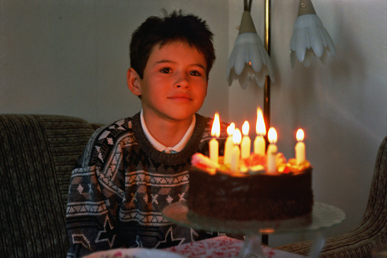
Synek
KL
kluczyki
Ocena będzie widoczna gdy zagłosuje co najmniej 5 osób.
mało ocen
Super
Dobre
pełny ekran
Opis zdjęcia
Brak opisu.
Komentarze
Kategoria
Ludzie
Dodane
14 lat temu
Więcej od kluczyki:
portfolio autora
wysyłam


Komentarze