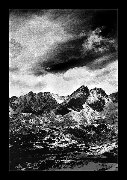
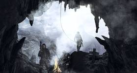
Krzysztof Dadak - w tym przypadku z tego co pamietam to nastopilo fitrowanie ale bylo zolte..calosc wiec byla dosc zolta takze..efekt dosc zblizony do czerwonego ..ale to w duzej mierze juz zasluga emulacji ..
ogólnie bardzo fajne, ta stylistyk podoba mi sie bardo ale... np. na samym dole jest partia szarości, która nie pasuje do stylistyki całości i bez niej było by fajniej. Mam przeczucie, że i papier-twardziel by takiej płaszczyźnie nie przepuścił :) pozdr
tak sobie patrze i mysle ze to Velvia ktora obrabiana kom. daje takie efekty ziarna , przy innych slajdach (provia,sensia) powstaja smugi,przebarwienia a velvia to wszystko znosi .... mnie sie podoba ten efekt ...Pozdr.
piekne zdjecie , poprzez B&W takie zimne surowe, a prze ziarno takie malarskie nieuchwytne...Koval..miło ze jestes na plfoto... a ziarno faktycznie wyolbrzymione do 1600 a nawet bym sie pokusil o stwierdzenie ze 3200:) Pozdrawiam.
No pikne góry - fakt - czerwony filtr da taki efekt. Kiedś oglądałem przedwojenny album o Pieninach - ryciny w nim wygladały kropka w kropkę tak samo - BOMBA ZDJĘCIE.
rojo - wykonane na slajdzie jak juz pisalem . Powstalo w trakcie prob wytworzenia jakiejs emulacji sielnie kontrastowych negatywow w PS ..nie robie na negatywach zbycz czesto ze wzgledu na moja metode skanowania itp itd ..dlatego tak a nie inaczej powstalo. Mialem doswiadczenia z negatywami i staralem sie je powtorzyc na innych materialach ...a wyszlo jak widac..
sax - :) , oczywiscie ,ze metoda ktora podales jest jak najbardziej ok ..mam jakies zdjecia ktore wykonalem na ilfordzie z czerwonym filrem i efekt jest dosc zblizony do tego co tu widac. Jednak to zdjecie jest inaczej wyoknane ( nie to zebym zarzucal Ci bledna dziagnoze :)) Choc w zupelnosci bylo stylizowane na efekt tego co przytoczyles. Orginal byl wykonany na kolorowym slidzie ..A powstalo w trakcie kiedy staralem sie znalezc cos w rodzaju cyfrowej emulacji wlasnie takiego efektu ..czyli silego BW kontrastu jaki daje ilford w polaczeniu z czerwonymi filtrami. Czy sie udalo ? To juz dla ogladajacych - . Ja postanowilem wzbogacic to w jeszcze intensywniejszy niz 400 ISO dalo by ziarno ..co jednak moge zapewnic to ze jest ono zlorzone w 100% z naturalnie istniejacego , nierownomiernego ziarna ..tylko jest wyolbrzymione jakby bylo to cos okolo 800- 1600..Z tad tez ten graficzny wrecz efekt. Dziekuje Sax .
Krzysztof Synowiec , dlaczego uważasz że to nie zdjęcie ? Dziwię Ci się , sam robisz fajne "górskie" foty. Jesli koval użył czerwonego filtra i twardego papieru ?. Masz murowany taki efekt. U mnie zobaczysz serię z kaszub - kiepskie skany z negatywu
ILFORDA ale niebo takie jest bo używałem w/w filtra.
Zresztą niech autor sie wypowie.
♣ Tak jak allel napisał(a) wyglad jak zdjęcie w starej książce. Ciekawe... kadr mi troszeczke niepsauje bo wszystko jest tutaj takie klasyczne... Pozdrawiam.
Komentarze
Burzliwe:)
piękne, niebko powala
kolysanie
nie przypadło mnie do gustu
Piekne zdjęcie. Ziarno i mocny kontrast doskonale podkreślają potęgę gór. Pzdr.
Granaty i Kościelec z Kasprowego.
szkoda tylko że w twoim portfolio jest tak mało zdjęc londyńskich miejsc.
piekielne wrażenie robią te czarne obramowania w sensie ze bardzo mi sie podobają;]
telegraf - nie probowalem innych slajdow konwertowac..velvia zachowuje sie dosc znosnie.
casp - patrz poprzednie posty
Krzysztof Dadak - w tym przypadku z tego co pamietam to nastopilo fitrowanie ale bylo zolte..calosc wiec byla dosc zolta takze..efekt dosc zblizony do czerwonego ..ale to w duzej mierze juz zasluga emulacji ..
dobre ale tylko dlatego ,że nie jest w moim guście----->wolał bym kolorowe widać ,że jest ostre wtedy MOIM ZDANIEM będzie to super fota.pzdr.
bardzo ... sprawiaja te nasz taterki na twoich zdjeciach ze sa ogromne olbrzymie o....
Świetnie robisz te mocne tonacje, tutaj jak pociągnięcia węglem, piękne. :)
ogólnie bardzo fajne, ta stylistyk podoba mi sie bardo ale... np. na samym dole jest partia szarości, która nie pasuje do stylistyki całości i bez niej było by fajniej. Mam przeczucie, że i papier-twardziel by takiej płaszczyźnie nie przepuścił :) pozdr
piekna fotografia
tak sobie patrze i mysle ze to Velvia ktora obrabiana kom. daje takie efekty ziarna , przy innych slajdach (provia,sensia) powstaja smugi,przebarwienia a velvia to wszystko znosi .... mnie sie podoba ten efekt ...Pozdr.
piekne zdjecie , poprzez B&W takie zimne surowe, a prze ziarno takie malarskie nieuchwytne...Koval..miło ze jestes na plfoto... a ziarno faktycznie wyolbrzymione do 1600 a nawet bym sie pokusil o stwierdzenie ze 3200:) Pozdrawiam.
miły dla oka efekt, moze za duży kontrast ale tylko o drobinkę - pozdro
koval - nudzisz tymi górami, ale niebo super. To czerwony filtr daje takie kotrasty? Super
No pikne góry - fakt - czerwony filtr da taki efekt. Kiedś oglądałem przedwojenny album o Pieninach - ryciny w nim wygladały kropka w kropkę tak samo - BOMBA ZDJĘCIE.
Krzysztof Synowiec - patrz poprzedni opis .
LinKuei - mysle ,ze masz duzo racji . Wielu znanych ..robilo kiedys tego typu zdjecia o podobnych tonacjach i moodach ...
rojo - wykonane na slajdzie jak juz pisalem . Powstalo w trakcie prob wytworzenia jakiejs emulacji sielnie kontrastowych negatywow w PS ..nie robie na negatywach zbycz czesto ze wzgledu na moja metode skanowania itp itd ..dlatego tak a nie inaczej powstalo. Mialem doswiadczenia z negatywami i staralem sie je powtorzyc na innych materialach ...a wyszlo jak widac..
ladne
seti - to nie jest wykonane na negatywie ..ale raczej zostalo w tym kierunku "uformowane " - patrz poprzedni post.
sax - :) , oczywiscie ,ze metoda ktora podales jest jak najbardziej ok ..mam jakies zdjecia ktore wykonalem na ilfordzie z czerwonym filrem i efekt jest dosc zblizony do tego co tu widac. Jednak to zdjecie jest inaczej wyoknane ( nie to zebym zarzucal Ci bledna dziagnoze :)) Choc w zupelnosci bylo stylizowane na efekt tego co przytoczyles. Orginal byl wykonany na kolorowym slidzie ..A powstalo w trakcie kiedy staralem sie znalezc cos w rodzaju cyfrowej emulacji wlasnie takiego efektu ..czyli silego BW kontrastu jaki daje ilford w polaczeniu z czerwonymi filtrami. Czy sie udalo ? To juz dla ogladajacych - . Ja postanowilem wzbogacic to w jeszcze intensywniejszy niz 400 ISO dalo by ziarno ..co jednak moge zapewnic to ze jest ono zlorzone w 100% z naturalnie istniejacego , nierownomiernego ziarna ..tylko jest wyolbrzymione jakby bylo to cos okolo 800- 1600..Z tad tez ten graficzny wrecz efekt. Dziekuje Sax .
Krzysztof Synowiec , dlaczego uważasz że to nie zdjęcie ? Dziwię Ci się , sam robisz fajne "górskie" foty. Jesli koval użył czerwonego filtra i twardego papieru ?. Masz murowany taki efekt. U mnie zobaczysz serię z kaszub - kiepskie skany z negatywu ILFORDA ale niebo takie jest bo używałem w/w filtra. Zresztą niech autor sie wypowie.
bardzo malarskie;dynamiczne i nastrojowe.
Proszę!Wysyłajmy tylko ZDJĘCIA.....
[niebo]
to negatyw ?
♣ Tak jak allel napisał(a) wyglad jak zdjęcie w starej książce. Ciekawe... kadr mi troszeczke niepsauje bo wszystko jest tutaj takie klasyczne... Pozdrawiam.
Witam sąsiada ...
Zajebiscie gorskie gory !
świetne, jak rysunek
jak rysunek
coś o technice?